Duel Academy
Would you like to react to this message? Create an account in a few clicks or log in to continue.

Duel Academy Log in

Get your game on!


descriptionTrying something more Anzo style xD EmptyTrying something more Anzo style xD

more_horiz
Soo yeah lol, got inspired to go beyond my curent knowledge and try something new and something that would look more like Anzo (didn't work obviously lol). 


Hope to hear your opinions ^^ 
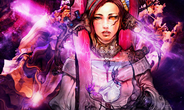

Trying something more Anzo style xD Signat21

descriptionTrying something more Anzo style xD EmptyRe: Trying something more Anzo style xD

more_horiz
excuse me while i go throw up


jk, nice try. you'll get there.

descriptionTrying something more Anzo style xD EmptyRe: Trying something more Anzo style xD

more_horiz
you are actually getting better the right side is pretty good, the only thing i dislike is that like deformation on the left side looks to forced

descriptionTrying something more Anzo style xD EmptyRe: Trying something more Anzo style xD

more_horiz
STX wrote:
excuse me while i go throw up


jk, nice try. you'll get there.

Lol, wouldn't be mad if you trew up lol Trying something more Anzo style xD 3974120512 I know, I just got inspired to do something diffrent Razz 
Drunkion wrote:
you are actually getting better the right side is pretty good, the only thing i dislike is that like deformation on the left side looks to forced

Yeah the right side turned better then expected since I didn't really touch much on it and maybe I focused too much on the left side and that is why it looks forced. 

Thanks to both of you tho Razz

descriptionTrying something more Anzo style xD EmptyRe: Trying something more Anzo style xD

more_horiz
well, next try to work on flow and light source and depth and focus point. especially focal point, all these colors are taking away the render chet and bc of all these sharp colors, it shows that the right bottom part is empty quite painfully. Light and depth are minor as of now, consider focal point and flow first. I really can not say much on flow since it differs from each render and u catch it by ur heart

descriptionTrying something more Anzo style xD EmptyRe: Trying something more Anzo style xD

more_horiz
Will try and work on it thanks ^^

descriptionTrying something more Anzo style xD EmptyRe: Trying something more Anzo style xD

more_horiz
No matter the kind of resources you use, without proper focal point and light source you won't get anywhere. It's an improvement, but you still use the same methods. Always have your render be the focal point and everything around it redirects the light towards its essential features (i.e, gun, eyes, hair, hand, power, etc.) each render has its own unique features.

KIU Wink

descriptionTrying something more Anzo style xD EmptyRe: Trying something more Anzo style xD

more_horiz
Thing is I don't really know how to do the focal point lol...

I am trying tho Trying something more Anzo style xD 3974120512 

Thanks ^^

descriptionTrying something more Anzo style xD EmptyRe: Trying something more Anzo style xD

more_horiz
The focal point is basically where you want the person to look first when looking at your tag. Normally it's the face of your render, or any unique feature your render might have. Making of focal points have many sub-methods; however, the standard method is you basically sharpen the area of where you want the focal point to be and blur/darken the surrounding areas. All of your light sources, effects, C4Ds must follow the natural flow of your focal point.

Take my current signature for example, the first thing you notice when you look at it - let me guess -, it's the eye, isn't it. That's a focal point.

descriptionTrying something more Anzo style xD EmptyRe: Trying something more Anzo style xD

more_horiz
I see...will work on it I guess ^^

descriptionTrying something more Anzo style xD EmptyRe: Trying something more Anzo style xD

more_horiz
It's decent, can't give you much credit since you used straight from a PSD

Hope to see your own work soon

descriptionTrying something more Anzo style xD EmptyRe: Trying something more Anzo style xD

more_horiz
chet, first thing I put my eyes on is the squares in BG on Anzo's sig ._.

and yeah focal oint applies to drawing too so its really wut stands out the most

yes ik I repeated myself 4 times alrdy but heh

descriptionTrying something more Anzo style xD EmptyRe: Trying something more Anzo style xD

more_horiz
I saw Anzo's font first tbh :c

descriptionTrying something more Anzo style xD EmptyRe: Trying something more Anzo style xD

more_horiz
thats the second thing lol

I saw squares first bc my first thought was "WTF did the opacity or fill went 60% by accident?" but I realized dis is not inside PS chet

descriptionTrying something more Anzo style xD EmptyRe: Trying something more Anzo style xD

more_horiz
Kandy.JPEG wrote:
It's decent, can't give you much credit since you used straight from a PSD

Hope to see your own work soon

I didn't use Anzo's PSD nor did I copy anything. I used on  of his works as an inspiration. It helped get an idea what I wanted to do.

And yeah I understand focal point I just need to practise it.

descriptionTrying something more Anzo style xD EmptyRe: Trying something more Anzo style xD

more_horiz
privacy_tip Permissions in this forum:
You cannot reply to topics in this forum