Duel Academy
Would you like to react to this message? Create an account in a few clicks or log in to continue.

Duel Academy Log in

Get your game on!


descriptionTrying Again EmptyTrying Again

more_horiz
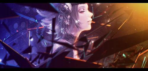
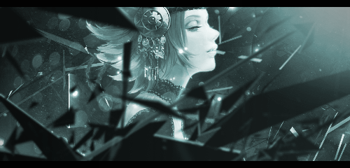
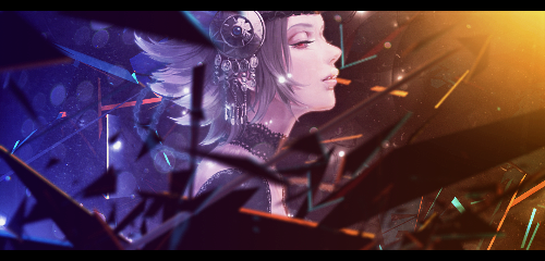
Well, I'm back at it again with these bad sigs. Like always C&C welcomed.
V1:
Trying Again Feathe11

V2:
Trying Again Feathe10

descriptionTrying Again EmptyRe: Trying Again

more_horiz
I prefer V2 because the render doesn't fit too well with the orange part of the V1. But both look good

p.s. this is a critic from a person who can't open photoshop Trying Again 3974120512 

descriptionTrying Again EmptyRe: Trying Again

more_horiz
V1 is better imo. You have to work a with lighting effects. Light source is too strong but render doesn't get any of that light of the face. I like how you did the back light though. Keep it up!!

descriptionTrying Again EmptyRe: Trying Again

more_horiz
I like V2 way better. Keep it up!

descriptionTrying Again EmptyRe: Trying Again

more_horiz
The classic shatter C4D

v2 is better

descriptionTrying Again EmptyRe: Trying Again

more_horiz
I've tried working on the light on the front of the render, but I can't really tell if it worked out. What do y'all think?
V1 (Edited)
Trying Again Feathe14

V2 (Edited)
Trying Again Feathe15

descriptionTrying Again EmptyRe: Trying Again

more_horiz
Can hardly tell a difference tbh

I suggest you erase some of c4d covering up the render takes away from the focal point

descriptionTrying Again EmptyRe: Trying Again

more_horiz
privacy_tip Permissions in this forum:
You cannot reply to topics in this forum