Duel Academy
Would you like to react to this message? Create an account in a few clicks or log in to continue.

Duel Academy Log in

Get your game on!


descriptionGodly Signature Showcase №8 EmptyGodly Signature Showcase №8

more_horiz
Back at it again ^^ Hope you enjoy this one since I think there is some great improvements from my last tags ^^ 


1.Godly Signature Showcase №8 Signat17(Had great plans for this one, but I just made it and it's 1AM where I live so it didn't turn out as I wanted...)
2.Godly Signature Showcase №8 Signat18
3.Godly Signature Showcase №8 Signat19
4.Godly Signature Showcase №8 Signat20


Opinions and constructive criticism are greatly appreciated ^^

descriptionGodly Signature Showcase №8 EmptyRe: Godly Signature Showcase №8

more_horiz
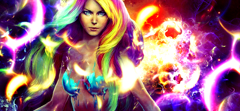
1st - bright af
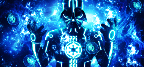
2nd - okay, don't use so much fractals, makes it messy
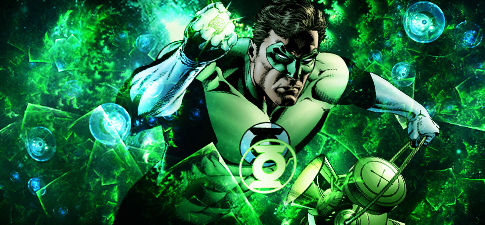
3rd - a bit bright, could use some good shading and gradient maps/tools
4th - okay

Overall, don't center your renders that much. Use more adjustment settings. Shade it, blur it, sharpen it, experiment with stuff. Use smaller sizes to reduce the messyness. You're overusing lights which makes your stuff lower quality. These could be very sexy with good darkening. Your compositions are starting to look more and more decent. You actually improved. Try making things go along with textures and c4ds like you're doing with fractals. Look at other artist's works and see what else you can do.

descriptionGodly Signature Showcase №8 EmptyRe: Godly Signature Showcase №8

more_horiz
Indeed.

First one is bad. Last one is decent. 2nd and 3rd are okay. 

Darker themes could work.

descriptionGodly Signature Showcase №8 EmptyRe: Godly Signature Showcase №8

more_horiz
Galaksii wrote:
1st - bright af
2nd - okay, don't use so much fractals, makes it messy
3rd - a bit bright, could use some good shading and gradient maps/tools
4th - okay

Overall, don't center your renders that much. Use more adjustment settings. Shade it, blur it, sharpen it, experiment with stuff. Use smaller sizes to reduce the messyness. You're overusing lights which makes your stuff lower quality. These could be very sexy with good darkening. Your compositions are starting to look more and more decent. You actually improved. Try making things go along with textures and c4ds like you're doing with fractals. Look at other artist's works and see what else you can do.

I don't really see how first one is that bright. There are just too many light sources that naket is look bright. I actually don't even know how it turned this way lol, at one point it was looking pretty good. But it's was very hard to make it good considering how many colour there are. 

Bout the second I agree the fractals were too much. But that is more of the theme of this showcase lol. Experimenting with fractals. And yes, they are much easier to work with then C4D in my opinion. Overall I think if I removed the puprle ones and put some redish ones in the place, the fractals would blend better and would make it look more complete. 

3rd one is a bit shiny, also I just loved the render and had to make something with it, so I decided fuck it. I started doing more stuff to blend better and overall I was satisfied with the results. Didn't want to touch it with too many adjustments since I was scared it might mess everthing up, just like it did with the first one. 

Really...the 4th is just okay? No "Well done its your best work and the first one that actually look like something!"? I'm disappointed lol. You all start to talk like Kandeh Godly Signature Showcase №8 3974120512 

Anyways your opinion is appreciated ^^
Lux wrote:
Indeed.

First one is bad. Last one is decent. 2nd and 3rd are okay. 

Darker themes could work.

Go make some GFX before bandwagoning Razz (joking) 

I have always used more darker themes before, my work has hardly been shiny so far, so this is really the first time delving into this more Gala style area. And it's pretty satisfying in the end lol Godly Signature Showcase №8 3974120512

And what about my last one? Razz

descriptionGodly Signature Showcase №8 EmptyRe: Godly Signature Showcase №8

more_horiz
1st one is real bad.
2nd is ok.
3rd is good but a bit monotone as its really just blue, try a bit of variation on that one.
4th one is nice i like it, but try adding more of that blue to mix it up.

The final one shows growth, so yeah keep it on that level.

descriptionGodly Signature Showcase №8 EmptyRe: Godly Signature Showcase №8

more_horiz
Pepchoninga wrote:
Galaksii wrote:
1st - bright af
2nd - okay, don't use so much fractals, makes it messy
3rd - a bit bright, could use some good shading and gradient maps/tools
4th - okay

Overall, don't center your renders that much. Use more adjustment settings. Shade it, blur it, sharpen it, experiment with stuff. Use smaller sizes to reduce the messyness. You're overusing lights which makes your stuff lower quality. These could be very sexy with good darkening. Your compositions are starting to look more and more decent. You actually improved. Try making things go along with textures and c4ds like you're doing with fractals. Look at other artist's works and see what else you can do.

I don't really see how first one is that bright. There are just too many light sources that naket is look bright. I actually don't even know how it turned this way lol, at one point it was looking pretty good. But it's was very hard to make it good considering how many colour there are. 

Bout the second I agree the fractals were too much. But that is more of the theme of this showcase lol. Experimenting with fractals. And yes, they are much easier to work with then C4D in my opinion. Overall I think if I removed the puprle ones and put some redish ones in the place, the fractals would blend better and would make it look more complete. 

3rd one is a bit shiny, also I just loved the render and had to make something with it, so I decided fuck it. I started doing more stuff to blend better and overall I was satisfied with the results. Didn't want to touch it with too many adjustments since I was scared it might mess everthing up, just like it did with the first one. 

Really...the 4th is just okay? No "Well done its your best work and the first one that actually look like something!"? I'm disappointed lol. You all start to talk like Kandeh Godly Signature Showcase №8 3974120512 

Anyways your opinion is appreciated ^^
Lux wrote:
Indeed.

First one is bad. Last one is decent. 2nd and 3rd are okay. 

Darker themes could work.

Go make some GFX before bandwagoning Razz (joking) 

I have always used more darker themes before, my work has hardly been shiny so far, so this is really the first time delving into this more Gala style area. And it's pretty satisfying in the end lol Godly Signature Showcase №8 3974120512

And what about my last one? Razz


That light behind her.

descriptionGodly Signature Showcase №8 EmptyRe: Godly Signature Showcase №8

more_horiz
CrimsonOverlord wrote:
1st one is real bad.
2nd is ok.
3rd is good but a bit monotone as its really just blue, try a bit of variation on that one.
4th one is nice i like it, but try adding more of that blue to mix it up.

The final one shows growth, so yeah keep it on that level.

Yeah I guess first one is pretty bad looking at it more. It was looking better before but I somehow messed it up lol Godly Signature Showcase №8 3974120512 

3rd one I don't really have anything diffrent to add. I did try but all it does is ruin the little flow there was so I left it like that. 

4th one is definitely my best work and I actually really like how it turned out Godly Signature Showcase №8 3974120512 did give it a good hour and something too ^^

And yeah @Galaksii I don't even know ended up so bright it might of been since I brushed it wih white to make some places stand out and then I resized some fractals.

descriptionGodly Signature Showcase №8 EmptyRe: Godly Signature Showcase №8

more_horiz
well, the blend is improving. The major thing now that concerns me, is that your colors are too bright and sharp in general. It's sure good to have sharp colors used in a certain spots but the way you use it is overdoing it. It kills the...."tone" of your shets. 
Idk, I feel like these can b easily changed tho, so if u don't mind we can discuss this another time maybe?

O right, I see that you save these as JPEG, why lol, save as PNG chet

descriptionGodly Signature Showcase №8 EmptyRe: Godly Signature Showcase №8

more_horiz
Yeah I see what you are saying and you are more then right ^^ 

Would love to discuss it some time Godly Signature Showcase №8 3974120512

Also I've always saved them as JPEG I don't know why lol Godly Signature Showcase №8 3974120512 

What is the difference @Bookingly?

descriptionGodly Signature Showcase №8 EmptyRe: Godly Signature Showcase №8

more_horiz
Jpegs have lower image quality. Png is the highest quality format

descriptionGodly Signature Showcase №8 EmptyRe: Godly Signature Showcase №8

more_horiz
Download a new pack of resources.

These are all good, though they're all similar except for the render you're using. I could critique one of them and copy paste the same phrase four times and apply it on your other works.

Things to work on:
- Light source
- Flow
- Shadows
- Contrast
- Depth
- Focal point

descriptionGodly Signature Showcase №8 EmptyRe: Godly Signature Showcase №8

more_horiz
CrimsonOverlord wrote:
Jpegs have lower image quality. Png is the highest quality format

Oh shit, didn't know that lol...thanks a lot I will resave allmy work Godly Signature Showcase №8 3974120512 
Anzo wrote:
Download a new pack of resources.

These are all good, though they're all similar except for the render you're using. I could critique one of them and copy paste the same phrase four times and apply it on your other works.

Things to work on:
- Light source
- Flow
- Shadows
- Contrast
- Depth
- Focal point

Well I just experimented with the fractal packs that @Galaksii gave me. I am using @Neji 's resources which I belive are more the enoughh lol Godly Signature Showcase №8 3974120512

I will try and improve on those parts for the next showcase lol thanks ^^

descriptionGodly Signature Showcase №8 EmptyRe: Godly Signature Showcase №8

more_horiz
Though there are cases that where I save my drawings as PNG and it ended up with 1.4 GB so I had to save it as JPEG lol

chet

descriptionGodly Signature Showcase №8 EmptyRe: Godly Signature Showcase №8

more_horiz
Omeh lol, I will see how big they are Godly Signature Showcase №8 3974120512

descriptionGodly Signature Showcase №8 EmptyRe: Godly Signature Showcase №8

more_horiz
I liked them for the most part. I'm not going to just repeat what everyone else has been saying, you know what you need to work on. Also the 3rd one is my fav. I have no issue with monotone sigs, seems like a very petty thing people tend to complain about.

descriptionGodly Signature Showcase №8 EmptyRe: Godly Signature Showcase №8

more_horiz
Thanks a lot meng ^^

I like how the 3rd one turned out too lol and I made it pretty fast. 

I do like the monotone look too, but I do understand where Crimson comes from Godly Signature Showcase №8 3974120512

descriptionGodly Signature Showcase №8 EmptyRe: Godly Signature Showcase №8

more_horiz
yeah fuck the haters bro.

descriptionGodly Signature Showcase №8 EmptyRe: Godly Signature Showcase №8

more_horiz
STX wrote:
yeah fuck the haters bro.

Will do bro  Godly Signature Showcase №8 3205713197

(I really like you tho Godly Signature Showcase №8 3974120512)

descriptionGodly Signature Showcase №8 EmptyRe: Godly Signature Showcase №8

more_horiz
privacy_tip Permissions in this forum:
You cannot reply to topics in this forum