Duel Academy
Would you like to react to this message? Create an account in a few clicks or log in to continue.

Duel Academy Log in

Get your game on!


descriptionMy First Signature EmptyMy First Signature

more_horiz
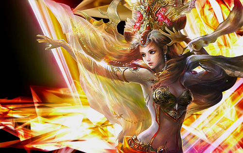
So since I had Photoshop and do know how to work with some of the things, as I have done some previous things on the program (Nothing GFX related tho), I decided to make an attempt on my first GFX work. I would love some advice on how to improve, as I had loads of fun and will definitely be doing more. 


My First Signature Signat10

descriptionMy First Signature EmptyRe: My First Signature

more_horiz
This seems very decent for a first time. I tried and it couldn't be even called as a very bad GFX attempt because I didn't even move from the render. 

descriptionMy First Signature EmptyRe: My First Signature

more_horiz
See if some of the tuts in this section are of any use to you, they're kind of out dated but its something for starter

http://www.duelacademy.net/f18-graphic-tutorials

descriptionMy First Signature EmptyRe: My First Signature

more_horiz
The Link that @Anzo has posted is a great starter for people getting into GFX'ing. It definitely helped me out a lot. 
Nice 1st attempt on your Signature. With some more GFX practice, I'm 100% sure you can become a GFX Artiste!
Good luck in your works @Pepchoninga

descriptionMy First Signature EmptyRe: My First Signature

more_horiz
Thank you ^^ I did look up some of the articles, but I'm mostly trying to experiment with the tools until I find how everything works.


Here is my second attempt. 


My First Signature Signat11


(@Anzo I secretly want your opinion kappa Razz

descriptionMy First Signature EmptyRe: My First Signature

more_horiz
Pepchoninga wrote:
Thank you ^^ I did look up some of the articles, but I'm mostly trying to experiment with the tools until I find how everything works.


Here is my second attempt. 


My First Signature Signat11


(@Anzo I secretly want your opinion kappa Razz


I've used this render before, quite tricky to catch the flow.

My First Signature OUOiWLB

You just keep experimenting. For starter, try to spend more than 2 minutes on your signature, spend at least 15 minute, keep adding things and removing things until you be like "it looks decent".

descriptionMy First Signature EmptyRe: My First Signature

more_horiz
Well atm, I'm having problems getting good c4d's and backgrounds like you get them. 


So just trying to experiment with as many things as posible. 

descriptionMy First Signature EmptyRe: My First Signature

more_horiz
Ever heard of deviant art? Dig that site up and just type C4D pack in their search bar and download all you can lol

descriptionMy First Signature EmptyRe: My First Signature

more_horiz
Never though of it lel Razz 


Wut about backgrounds...that shit is hard for me to find as well My First Signature 3974120512 

descriptionMy First Signature EmptyRe: My First Signature

more_horiz
Google stuff you think fits with your render, like if you got a warrior render Google "battlefield" of if you've got a princess render Google "palace" and things like that. Then you add C4D or any other effects to it.

descriptionMy First Signature EmptyRe: My First Signature

more_horiz
Thanks a lot.


One more thing: What size do you make your signatures, since I like it a lot?

descriptionMy First Signature EmptyRe: My First Signature

more_horiz
Anzo's current Signature is 500x300.

descriptionMy First Signature EmptyRe: My First Signature

more_horiz
It's 500x300, but when i first started 400x140 was a thing. Then i moved to 400x180 and 400x200. It's anything you feel comfortable with. I've even worked on 1000x500 or bigger numbers at some points, my biggest was 8000x2000 (that was for a job though) lol. But, keep it small for now. 400x140 should suffice.

descriptionMy First Signature EmptyRe: My First Signature

more_horiz
For the couple after the first one I've used 500x315, since it looked relatively good in Photoshop, tho It probably will be better to lower the hight a bit. 

descriptionMy First Signature EmptyRe: My First Signature

more_horiz
Smaller spaces means you get to focus more. So it's better for beginners.

descriptionMy First Signature EmptyRe: My First Signature

more_horiz
I'm curently experimenting with size as well.


All and all, it's incredibly fun, and the basics are not as hard to understand as I first thought to.

descriptionMy First Signature EmptyRe: My First Signature

more_horiz
Nah, you should understand everything you need to know in a matter of few days, though advancing from there is up to your imagination.

descriptionMy First Signature EmptyRe: My First Signature

more_horiz
Nigga's fate?

I'm sorry the text is too bright for me to see vividly.

descriptionMy First Signature EmptyRe: My First Signature

more_horiz
Ninga's Fate. Get your dog to read it My First Signature 4204681869

descriptionMy First Signature EmptyRe: My First Signature

more_horiz
Nigga's fate lol. That nigga's fate is a dragon.

descriptionMy First Signature EmptyRe: My First Signature

more_horiz
It's mah dragon...


You the nigga My First Signature 1151057309

descriptionMy First Signature EmptyRe: My First Signature

more_horiz
privacy_tip Permissions in this forum:
You cannot reply to topics in this forum